Below are some data visualization graph examples that have helped me with answering project questions.
Example1: Sentimental distribution: big organization employees´ reaction to Big Data as the new technology.
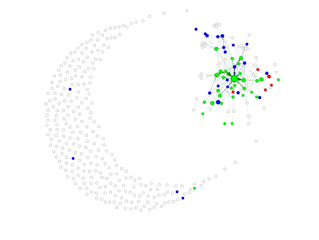
Green: Neutral
Blue: Positive
Red: Negative
White: No Sentiment
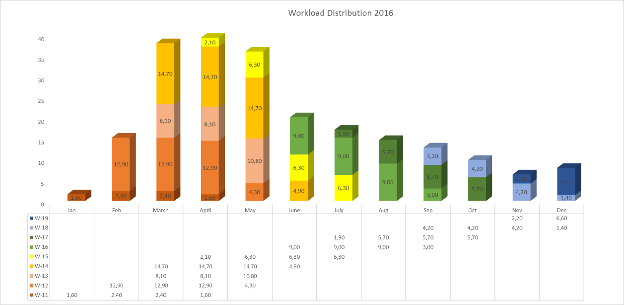
Example 2: Project Workload Visualization.
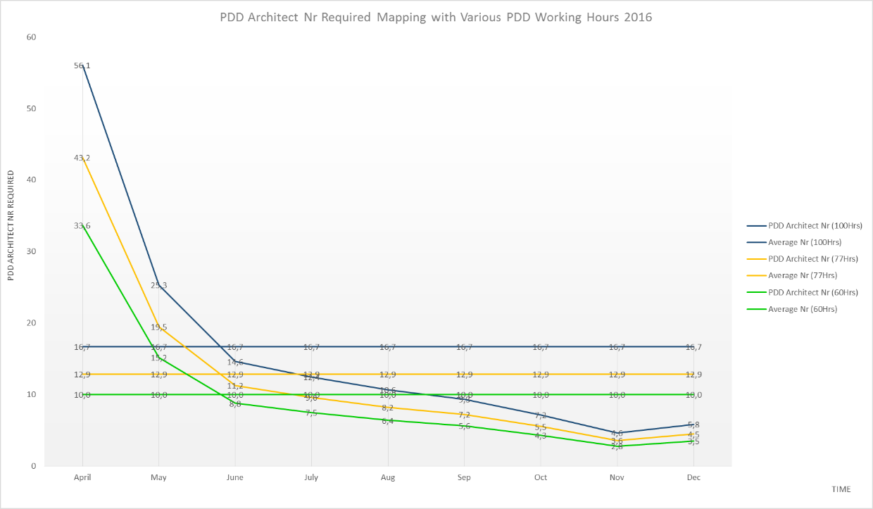
Resource Requirement Visualization:
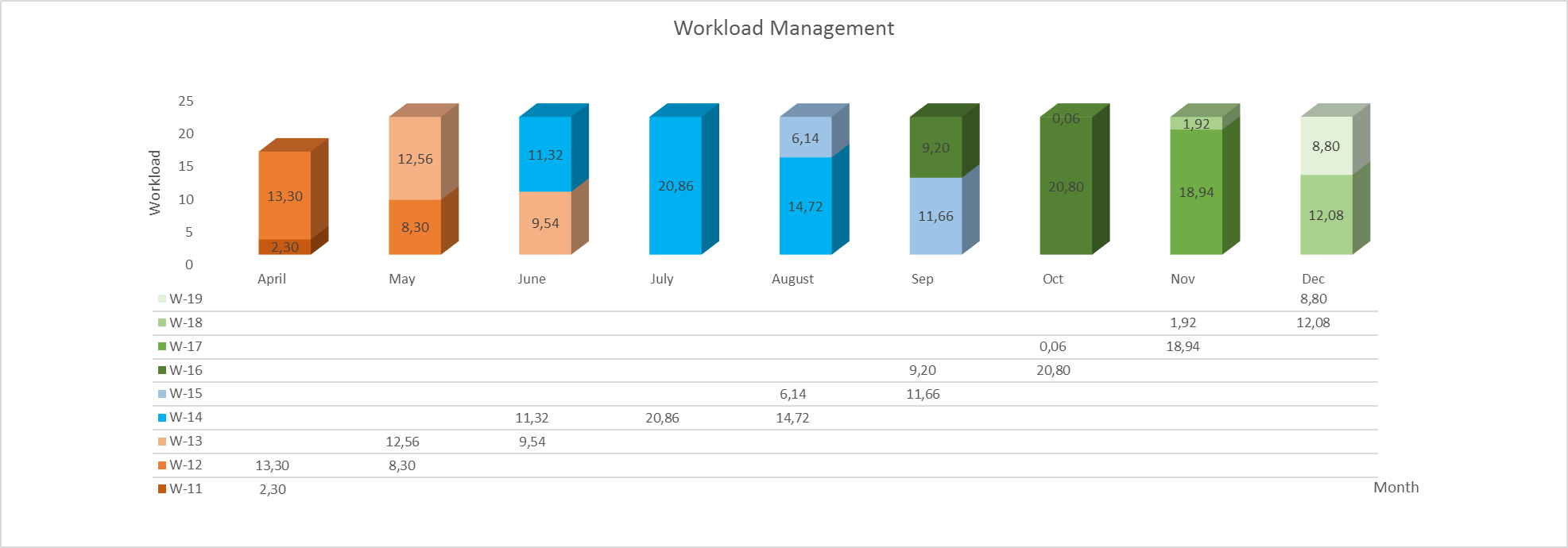
Workload Breakeven Management:
Tools I have used: Gephi, SPSS, and Excel.

Leave a comment